COHOSTING
UX/UI design, web design, offline product design.
Cohosting is an intermediary company that manages complementary services for hotels, tourist accommodation and for travelers in general.
The main tool offered is a personalized web page for each accommodation, in which the guest could see activities, tours and services adjacent to their stay, to facilitate their stay and enjoy 100% of the city. It gave all the control and a new way of income to the owner or manager of the accommodation.
The work I did with them ranged from understanding and conceptualizing the needs of the brand, to carrying out graphic design work and necessary presentations for different startup contests and awards.
Presentations, slides
An example of presentation design for investors and for contests such as the South Summit, this type of slides that you can see and download here.


Download the presentation for the South Summit Event here

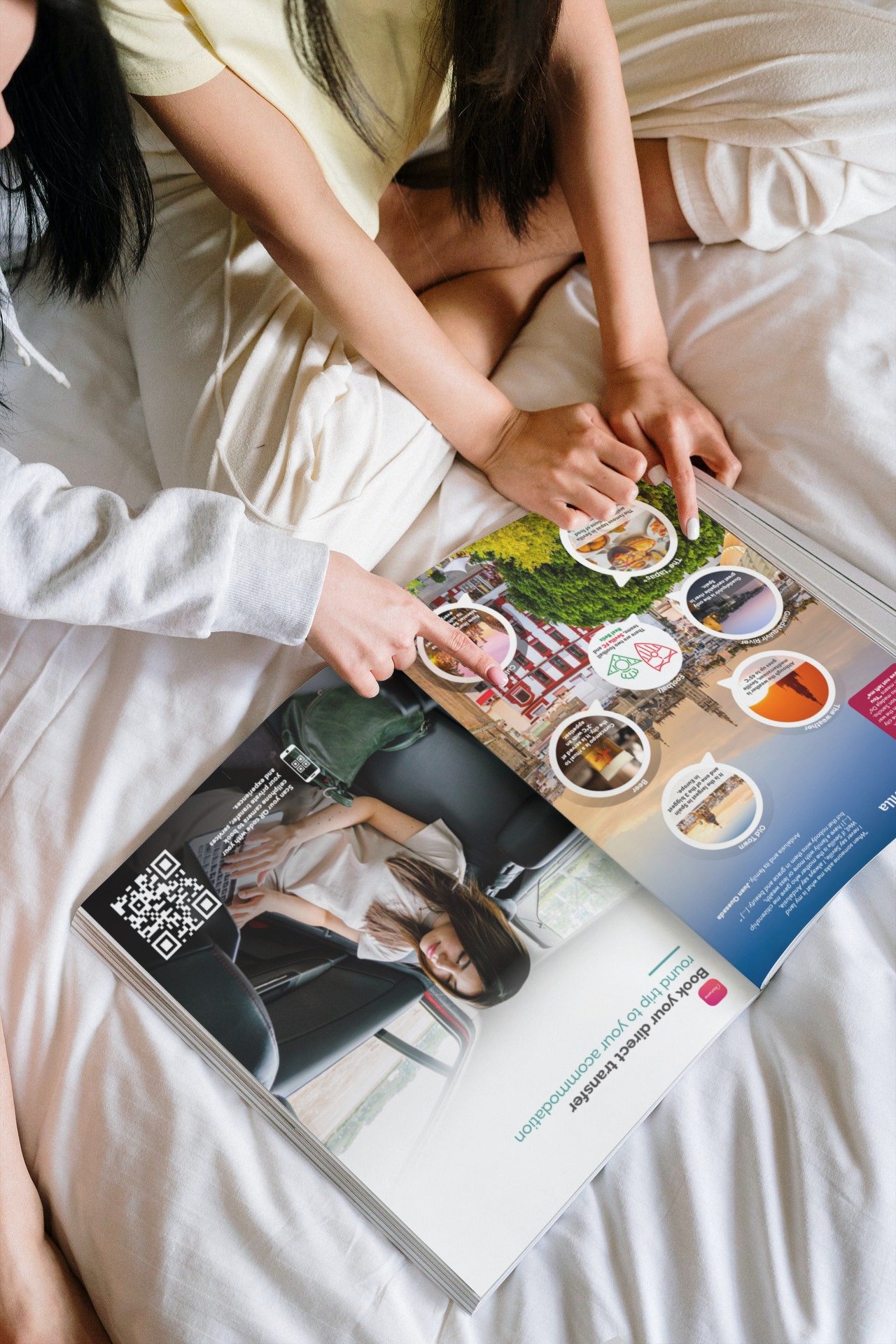
Traveler's Guides
Other similar projects in graphic design and visual design can be explained as a data collection in the form of a magazine for any host or any guest who wanted to tour the city and needed more information.
That is, the aforementioned web page that we made for each host, but in paper version.
These are physical magazines that exist in hotels, airbnbs, etc. and that can be consulted at any time, including a special version for Christmas.

advertising graphics
Other works have been advertising, graphic design such as flyers and posters for events.


UX/UI Design
For the design of the platform, a study of what Cohosting was prior to my collaboration with them was carried out. The structure created was not crazy, but it did not work particularly well, and the entire platform was missing so that the host could carry out their work: upload their own activities, manage the services they wanted to add, custom things, etc.
Entry

Before, in order to enter the website made for each host, there was a common home page for all accommodations, a gateway.
In it, a code would have to be entered that the guest had to obtain from the host in some way, and that would allow them to enter the personalized page of their accommodation.
Within this accommodation page, they offered the services and activities that the manager had agreed to contract through the agreements that Cohosting had closed with different providers.
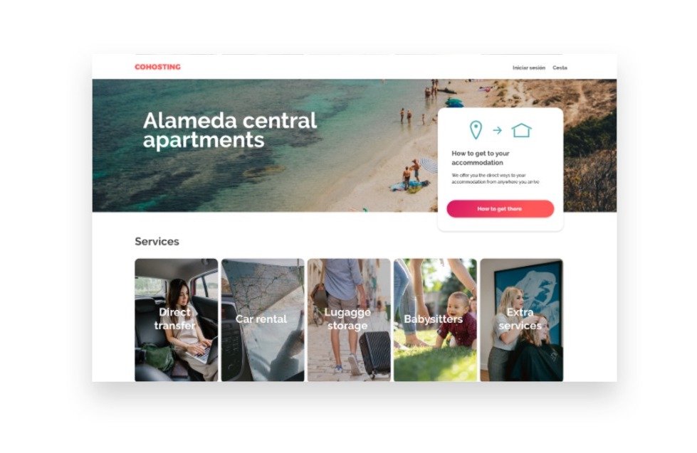
Guestbook
Here is a sketch of the custom page for the hotel or airbnb, which is presented later as a before and after.
For a more personalized feeling, the company logo appears, a photograph of your space and a short description.
There was a downloadable host guide that was a bit of a rudimentary version of the graphic design version you can see above, but it wasn't off the mark.
In my opinion, the structure was a bit lacking, too much Scroll so that the user could start to see the products that he could buy, a wasted header, a very poor mobile version (of which I have no proof, I did not take a screenshot), and an unattractive structure with rather poor CTAs.

Landing page for hosts
On the other hand, the host recruitment page to offer these same services adjacent to the accommodation, left much to be desired. Not only was it unattractive, it was not easy to read or communicate with Cohosting. Nor did he invite them to know how the affiliation agreement system worked, nor the benefits for them.

What else is there to say…

complete redesign
UX, strategy
PAIN POINTS Guestbook
Guest book access
Starting with the Guestbook, as I have said before, Cohosting worked for the guest as a presentation screen that required a “password” to be able to access the personalized page of the accommodation.
At this point I found several inconveniences, especially in direct contact with the guest, who, if they are not familiar with a lot of technology, might not understand why they had to access a website with a password for their stay.
Initially, no contact with the guests before their arrival was proposed, and what existed were some flyers with the password written by hand according to each host, leaving a lot of uncertainty if the client made a check-in without contact.

Solution
Given that the most relevant services for the traveler would be a direct transfer from the airport to the apartment, a late check-in, or a service to refill the fridge before your arrival at the accommodation, it did not make sense to wait for the check-in so that they proposed to have these services available to you.
The conclusion was that hosts should have the power to send a message with recommendations before the arrival of visitors, through a personalized URL directly to their Guestbook.
For this reason, we designed a Guest journey, that is, a timeline with predefined messages studied to carry out the upselling of these services.

Thanks to the design of the backoffice they could have access to these changes, from configuring when to send these messages in their own words to the way in which to send them (WhatsApp, SMS, email) and that they could be sent automatically depending on the days before the arrival and during the stay.
Guestbook Hierarchies
The general design of the Guestbook could be respected up to a point, now that we have the guest in her house comfortably viewing the web from a computer (thanks to Journey), we could offer more services.
The main problem was the visualization of this information, which within the possibilities of the company, was not badly expressed, but it did not work well nor was it apparent.

Solution
A more cohesive structure with a fresher and more friendly design for a guest who deserved more than just a few photos and a non-interactive map.
Less importance to the header and taking advantage of the space to put more CTAS and upselling
The hierarchies were maintained as much as possible, although we prioritized the airport transfer at the top of the page, since it is an essential service and that the guest will want to reserve before and after their arrival.
You can compare both version at the end :)
complete redesign
UI, visual renovation
1. typography selection

Why Raleway? Raleway offers a friendlier look than a typeface Cohosting already used: Calibri. Basically, it's an easy type to find in the operating system they used.
Cohosting needed a facelift mainly to make it attractive to travelers, tourists had to feel comfortable and easy to use a platform, and we approached this design first with the visual aspect, for technical reasons.
2. brand washing
Before

La imagen de Cohosting, creada por el CEO de la empresa, se basaba en el concepto de que juntos, hacemos más. Su visión fue: “más y más, es mayor que solo más”.
With some make up on
I was not allowed to change the logo, but I was able to make it up a bit to make it more modern, using a gradient between the color of the brand and a red towards magenta, adding the “COHOSTING” logo to transition the brand until only having this name as an image. . Spoiler alert, it never happened.
3. Colors
The only color in Cohosting, and the one I had for everything, was red, a somewhat problematic tone in my opinion.
In order to use more colors, I studied the complementary ones that could look good and from a single reddish tone we got 4 more.
Before

New palette of colors and gradients

3. pictures, general tone


As you can see, we have gone from red icons to photographs and a little more personality in the general vision of the brand.
The idea is to look for a profile that feels identified with the image that you want to give of cohosting. Travelers, visitors to a city who stay in accommodations such as boutique hotels, minimalist hotels, houses and airbnbs. Companies that spend their time making the guest feel like a local, not like a lost tourist.
styleguide
Comprehensive platform style design for client and host.
New image in general, with the new green color as the main CTA and protagonist of the points to highlight on the page, in this case icons and other graphic resources.


The main CTAs, such as checkout or reservations, are kept in the original color of Cohosting, with the addition of the gradient to try to take away a bit of the previous chalk color. For the link buttons and the secondary buttons we will have the new green gradient, less aggressive and more distinctive of the brand.

let the comparison games begin!
Before Guestbook

After Guestbook (pulsa para verla más grande)
Before Landing page

After Landing page (pulsa para verla más grande)
Something more
Here I show some more pages that may be of interest, although the general work that I want to show is this complete redesign and all my collaboration with Cohosting that meant a year and a half of total challenge in a startup that worked and continues to work :)


