inveert
UX/UI design and web solutions.
Inveert is a company dedicated to financial advice dedicated to investments, whose objective is to make this world understand a non-financial profile.
In addition, the essential differentiating point of Inveert, is that the company not only uses risk and time in these investments, but also the objectives of your investment.
During my collaboration with them, my work consisted not only of being a UX/UI designer, but also of providing graphic and advertising design services necessary for events, investors and contests.
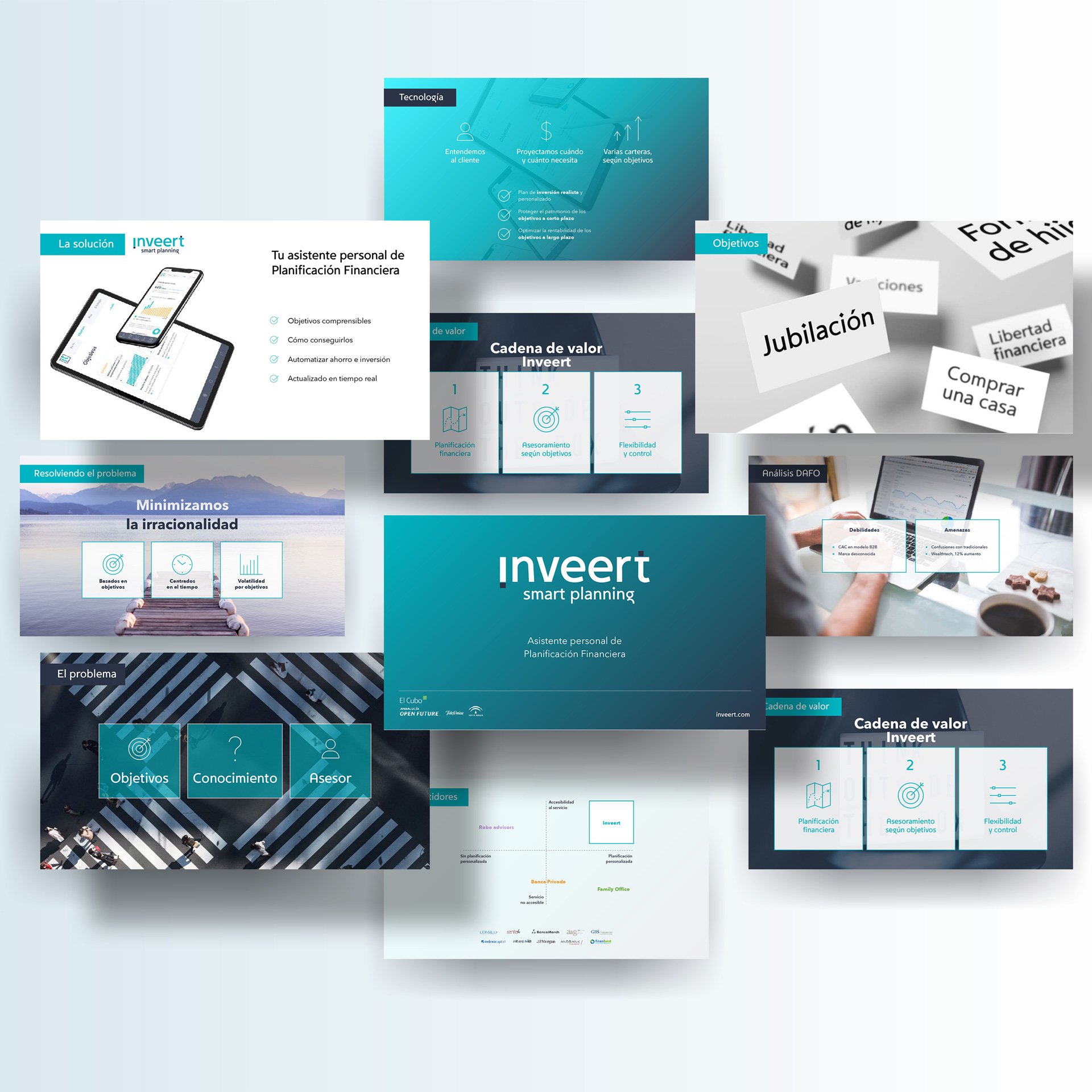
DESIGN OF PRESENTATIONS, SLIDES
Here you can see an example of a presentation for investors, delivered to the startup incubator El Cubo, from Telefónica Open Future.
You can download the presentation here
advertising graphic
For Inveert, it was important to have visibility at events and contests that was attractive, not constantly reminiscent of the old hackneyed idea of a bank where they don't care about your investments, but rather something automated, lightweight, easy to use and that conveyed trust.


UX design
For this tool, I had to come up with a major structural change, first to understand myself how the tool worked (I'm not an investment geek), and then so that the target customer would understand it better. At first, this made me an ideal designer for the project, since the target audience was young people to teach that the world of investments is not like Shark tank.
UX, Restructuring
pain points
First, to say that Inveert had as a strong point the idea of objectives, not only the creation of a risk profile, that innovation gives rise to an attractive structure, based on objectives and benefits and graphs from there. The problem is that the general architecture was not this.
The inveert system
Inveert worked with a rather flawed system, from a user acquisition landing page.
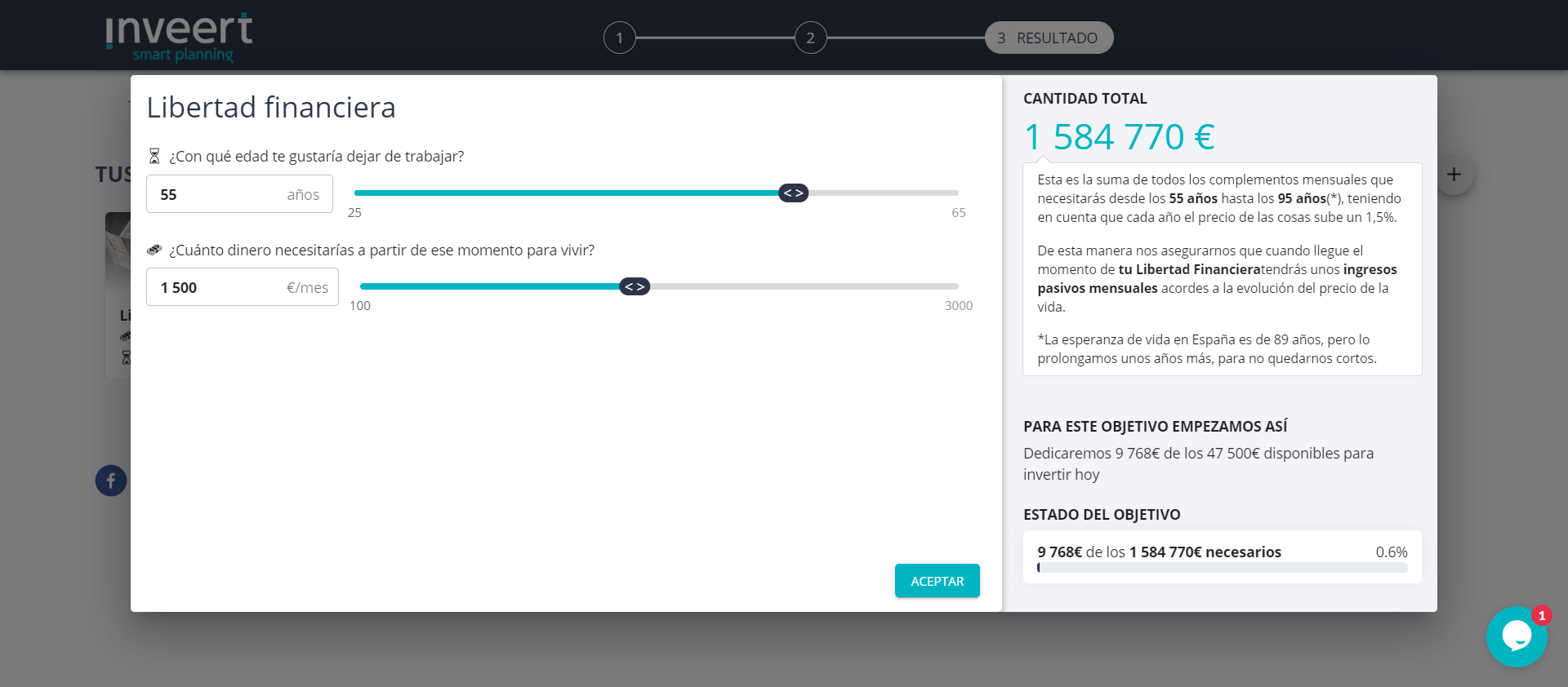
1. Selection of objectives. In each one, the user has to choose dates, ages, amount to contribute, initial contribution, etc.
2. Personal form. With personal data, but without email or password for the automatic creation of a profile.
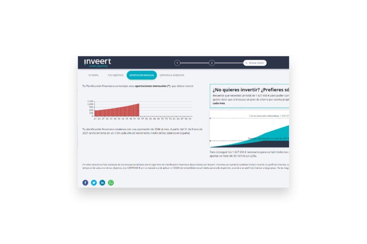
3. End result. The result of these forms and questions was the user's investor profile together with a simulator, a very important part and the most attractive (in my view) of all user acquisition.
Result, and lack of CTAs
With these results, the user would have to be able to contact Inveert in its initial phase, since although the idea was to have an automated investment system from a single app, at the beginning of this startup the only thing they could do was finish this process with a Appointment to consult with the professionals who founded the company.

This is the final result that existed in Inveert. I have highlighted the tabs that in my opinion go unnoticed compared to the stepper, which is not very striking either.
Clear faults
One way trip. We don't see a back button, nor were previous steps of the stepper clickable.
There are no CTAs. If the goal is for them to contact the company, where is the call to action?
Information architecture. The way the information is presented is not correct or intuitive. Tabs are not well understood, displayed correctly, or perceived as such. Your investor profile is not the most relevant, but your strategy and being able to start with it as soon as possible. And a long etc.

Continuing with more information presentation failures, when we get to the investment plan we find a page full of text, without a user-friendly grouping, and, again, without a CTAs to start with this investment plan.
What can be seen in the screenshot is a general investment strategy, which Inveert did not offer later, and then an investment plan according to objectives, which is the core of the business.
In addition, the risk management that is seen at the bottom of the screen is a point of information that was wanted to be represented throughout the plan, so that the user was calm with his investment. This has the same role as the rest of the points when in reality it is only static information that will always appear regardless of the plan that appears in each user.
investment simulator
The most interesting part of the plan, the most interactive and with which you can really see where your money is going and how you are going to invest over the months. It didn't work because until you finished a long process of forms and personal information, they gave you the most apparent part of the app.
personal test
In order to access your plan, the journey that must be made is of sensitive information, including contact data, without ensuring that they will not contact you, that they will not use your data, on a subject as delicate as money and investments. .
The plan / Strategy
They offer a generic plan and a joint strategy when this service was not possible in any way, it was not a product of their startup. On the other hand, the plan by objectives is a little more reliable, although there is still no engagement.
Information and security
The information is displayed as in a book, knowing that even if the user reads what he needs, he needs a simple way to acquire this same information. No graphics, or poor graphics, no explanatory infographics, nothing real and understandable.
income
First of all, no users were participating in their process, because it was not clear what they were signing up for. Also, the MVP was a CTA "Contact Us" button to schedule a meeting with a finance professional, non-existent on this screen.
My challenge
Generate leads through a decent landing page
Make an application that collects all these steps and investment plans.
How do we do it? Reorganizing all the information.
BEFORE
I present the flow of user behavior from when they come into contact with Inveert, until they reach the barren plan.
1. Landing page. Where I found information on security, investments and the core of the company, although not in a super attractive way, but as plain text accompanied by poor images. We found CTA to the test.
2. Quiz. We give all our sensitive information and take a tedious and long test without visual support and with questions that may be uncomfortable or difficult to answer.
3. End. We arrive at the amalgamation of test results, which encompass the plan, the profile, the strategy, the objectives, and its firstborn.
AFTER
My vision of how this could be made practical and useful:
1. Landing page. Information, security, everything the user needs to know, but better arranged at the information architecture level. Also:
The simulator is exposed
Attractive call to action towards the test
2. Quiz. Selection of objectives and endless test. Unfortunately, even if we wanted to, being a matter of investments and money, it is not possible to carry out a risk profile without certain sensitive data.
3. App / Results page. With division of the important and interactive parts of Inveert. This includes:
Dashboard – Static information and monthly investments
Objectives – Individual strategies in detail
Strategy – Monthly Investments
CTA to start investing
UX design with UI touch
comparison and results
Style guide, UI redesign
Inveert's style guide was more or less worked out, with a traditional logo similar to that of a bank, and suitable colors for this type of application. The scope for innovation was not very wide.
However, I introduced some decorative elements, I changed the type of photos that appeared on the entire page and all the forms.
I also adapted buttons and used the more secondary colors to give the page a brighter tone.
before
Test results, the so-called “Plan”
Profile

Goals

Details of the goals

Mensual fee

Investment strategy

after
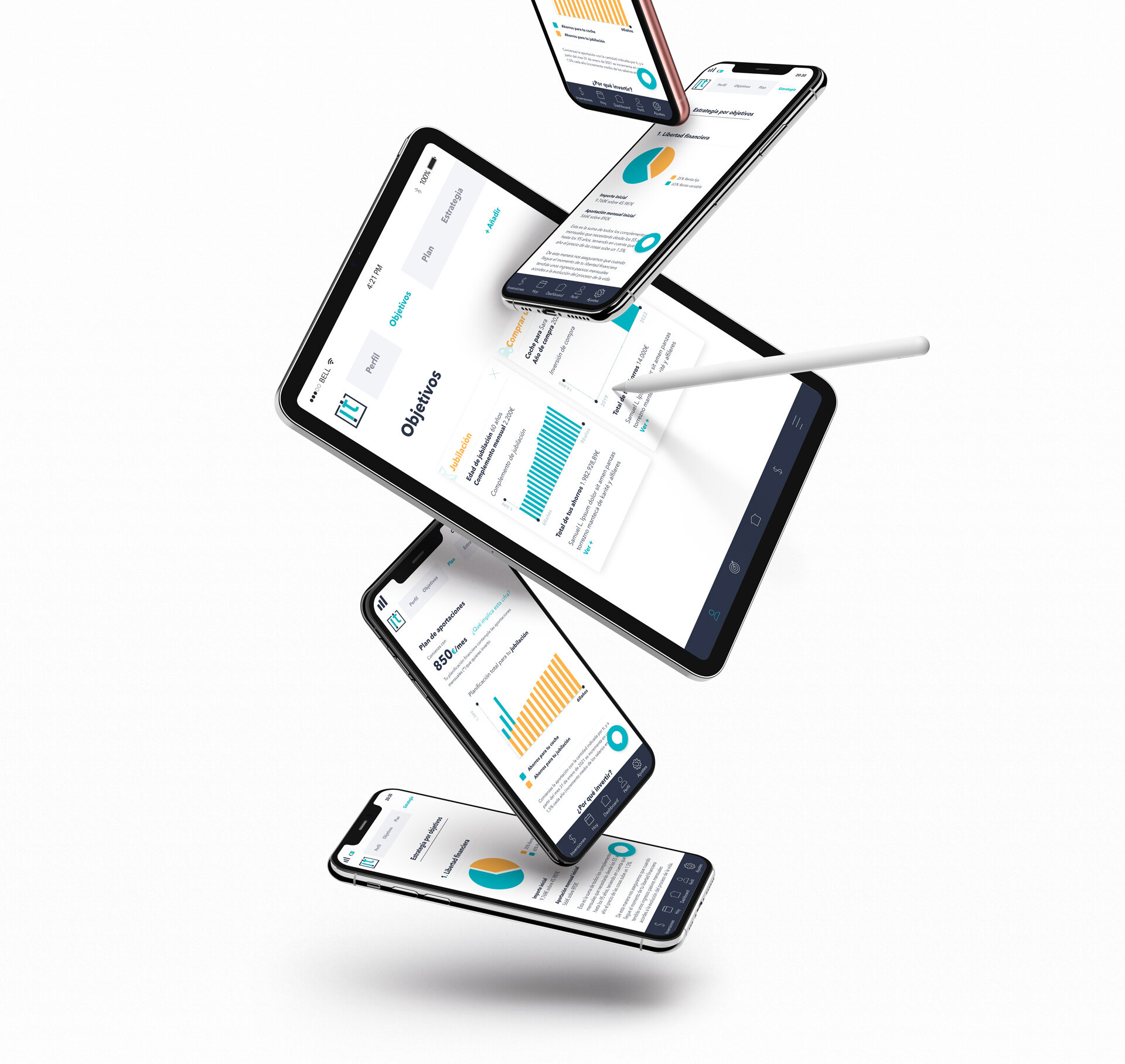
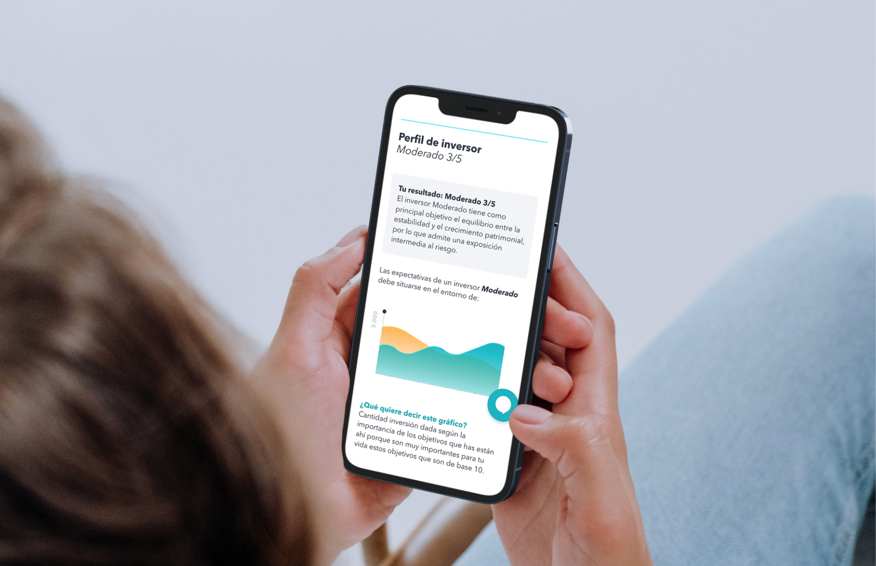
Test result, platform or app
1. Investor profile

2. Objectives of your investment plan

3. Detail of the investment plan by objectives: Retirement

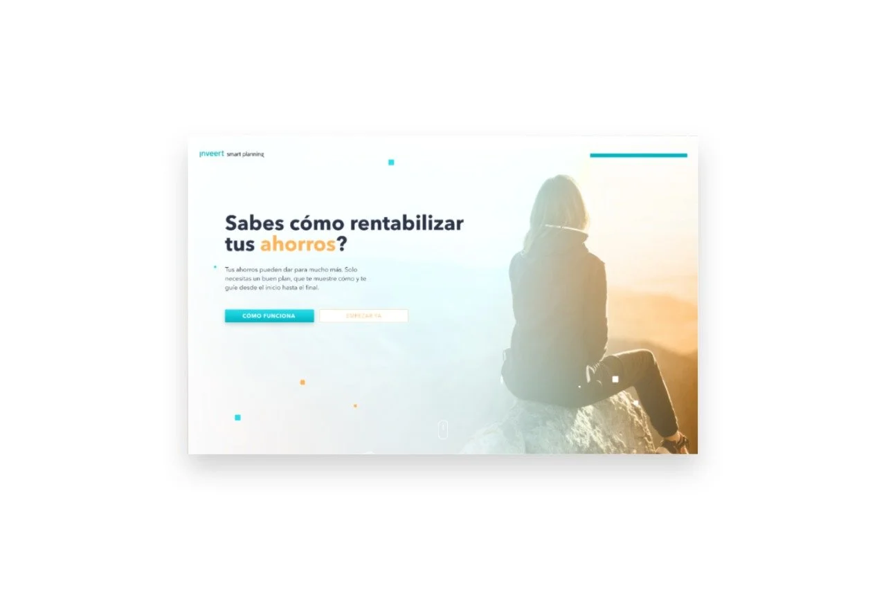
LANDING PAGE, version i
I don't have screenshots of the page before the redesign, so I leave the UX/UI redesign alone

LANDING PAGE, version iI
Less interactive, for development reasons, but more attractive.

EXTRA
To start collaborating with Inveert, they asked me for a first job with them. They had a completely free investment guide, which they offered as a hook on their website. For this guide, they needed Google Display creatives and a dedicated landing page for this.